The Role of AI in Fashion Color Analysis
Milan Fashion Week, one of the biggest and most anticipated events in the fashion calendar, always delivers stunning collections that inspire the upcoming seasons. For Spring/Summer 2025, the color palettes showcased on the runways not only reflected the designers’ creative visions but also highlighted emerging trends that are set to define the season. Fashion analyst Made Lapuerta, from databutmakeitfashion, took a unique approach to analyzing these collections by writing a code that used artificial intelligence (AI) to examine the colors presented in the runway shows of some of the most prominent brands, including Bottega Veneta, Ferragamo, Max Mara, and Versace.
In a groundbreaking effort, Lapuerta utilized AI to analyze the images from these Spring/Summer 2025 runway shows, pulling data from hundreds of pictures and categorizing the colors according to their frequency. The results of this analysis provided a visual map of the most prevalent colors on the Milan runways, revealing patterns and color preferences that may guide fashion choices for the upcoming seasons. This AI-driven method is a perfect example of how technology is becoming increasingly integral in the fashion industry, providing insights that are often too complex for manual analysis.
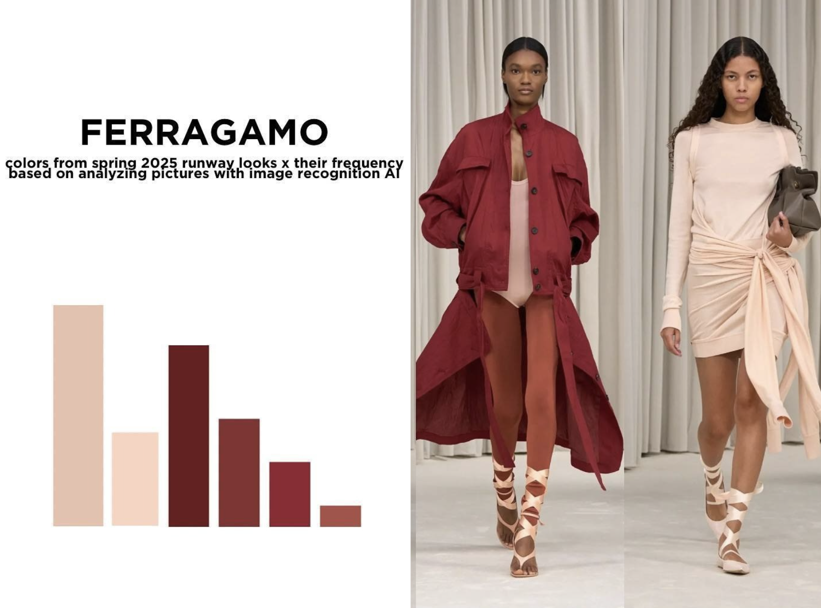
The visual data was presented in the form of color bar graphs, each one representing the dominant hues that appeared in the collections of the various brands. Each runway show had its own distinctive color palette, reflecting the design ethos of the brand and its interpretation of the season’s trends.
The Colors of Versace
For Versace, the color palette was strikingly bold and intense, with deep greens and earthy tones taking center stage. The collection featured shimmering golds that gleamed on metallic fabrics, creating a dramatic and high-energy feel. Versace’s runway looked at the power of contrast, pairing these bold colors with neutral tones that allowed the metallics to pop. The AI analysis of the colors in the Versace collection revealed a strong preference for dark, rich hues, with gold as the standout color, embodying the brand’s glamorous, high-octane aesthetic.

Max Mara’s Earthy Neutrals
Max Mara’s Spring/Summer 2025 collection was dominated by earthy neutrals, with soft browns, beiges, and warm tones filling the runway. The minimalist designs were paired with subtle and muted hues, giving the collection a sophisticated, modern feel. AI analysis of the colors in Max Mara’s looks showed a preference for warm tones that communicated elegance and timelessness. The palette was understated yet impactful, emphasizing the brand’s signature clean lines and refined aesthetic. Max Mara’s focus on neutral tones suggests that natural, calming hues will continue to dominate luxury fashion.

Ferragamo’s Soft Pink and Rich Reds
Ferragamo’s color palette for the season was soft and elegant, with delicate shades of pink and peach contrasted by richer red tones. These colors exuded femininity and softness, yet were powerful enough to leave a lasting impression. The AI analysis revealed that the most frequent colors in Ferragamo’s collection were warm pinks, deep reds, and earthy browns, capturing the brand’s signature blend of sophistication and strength. This color choice evokes a sense of quiet luxury, making Ferragamo’s collection an embodiment of subtle sensuality.

Bottega Veneta’s Soft Pinks and Purples
Bottega Veneta’s collection took a more muted and subdued approach with a soft, pastel-heavy color palette. Pink and lavender shades were particularly prominent, with a focus on soft textures and innovative, tactile fabrics. The AI’s analysis of the colors showed a range of pinks and purples, subtly punctuated by darker hues of burgundy and red. This collection embraced soft, feminine tones while maintaining the brand’s minimalist approach. The interplay between the pastel shades and darker accents made for a dynamic, modern aesthetic that perfectly embodied Bottega Veneta’s commitment to innovation and craftsmanship.

Personal Preferences: Ferragamo and Max Mara Stand Out
Out of all the collections analyzed, I found the color palettes from Ferragamo and Versace to be the most intriguing. The warm, rich tones of Ferragamo’s collection, with its mix of soft pinks and deep reds, captured the perfect balance between femininity and power. Meanwhile, Max Mara’s neutral, earthy palette exuded understated elegance, showing that simplicity and refinement are never out of style. These two collections stood out for their ability to create strong visual impact through the careful use of color, demonstrating the power of color in shaping a brand’s identity.


David Bradley
November 12, 2024 at 3:24pmLorem ipsum dolor sit amet consectetur adipisicing elit. Dignissimos eaque dolor fugiat architecto nihil ipsum. Corrupti sit nobis dicta obcaecati earum aperiam veritatis sunt. Natus consectetur dolorum fugiat adipisci rem.